Multimodal Examples
The Ford Model U
SpeechWorks was hired to design a multimodal in-car system for Ford’s “Model U” concept car, shown at the International Auto Shows in Detroit and New York. Ford’s white paper on the Model U can be found here, and our ACM Communications article focusing on the multimodal interface can be found here. The interface allowed the driver to control climate, entertainment, navigation, telephone, and preferences. I took a “say what you see” approach, making the GUI educate the user about voice commands. In this way, new users required no documentation to get started using speech (beyond telling them to push and hold the “talk” button). If they said the words they saw on the graphical controls, it would simply work. Of course, shortcut commands existed for more advanced users.
Usability testing for this project was a challenge and ultimately fun. We had participants complete tasks using screen shots of our interface prototype. The test moderator would be the “recognizer” either advancing the screen shots based on the participant’s utterances, or responding with error handling. At the same time, we wanted to simulate the inherent risks involved in driving a car while manipulating peripheral features. To this end, we had usability test participants complete a distractor task while interacting with our design prototypes. In some cases, the distractor task was Tetris. At other times, we had them play a driving video game. Participant payment was then tied to performance on the distractor task. This approach allowed us to isolate and refine any part of the interface that demanded too much cognitive overhead from a potential driver.
One of the greatest moments of my professional career occurred at the New York International Auto Show when a vice president from a rival car company got into the Ford Model U and said to the car “Play the Rolling Stones.” Without hesitation, the car said the command back as recognized and then played “(I Can’t Get No) Satisfaction.”
NaturallySpeaking 5.0
NaturallySpeaking is Nuance’s desktop dictation software. It was formerly the product of Dragon Systems. I was brought in to Dragon as their first and only usability engineer. Here was a perfect example of a product that had placed the price of admission far too high for new users. In order to know what voice commands were available, the person had to sift through an extensive list of commands in the documentation. The GUI gave no hints as to what could be said. For example, to open the “File” menu by voice, the user had to say “Click File.” How were they to know to say “Click?” Among other efforts, I wanted to better integrate the voice commands and GUI. I visited users in their homes and businesses to watch them use the product. I ran informal usability tests on a continuous basis, not letting participants look at documentation. When I started the process, usability participants could not use their voice for anything but dictation. By the time the next version of NaturallySpeaking was released (Version 5.0), participants were correcting misrecognitions and selecting menu items without ever using their hands. To open the “File” menu, users now only needed to say “File” – which is what they had expected in usability tests.
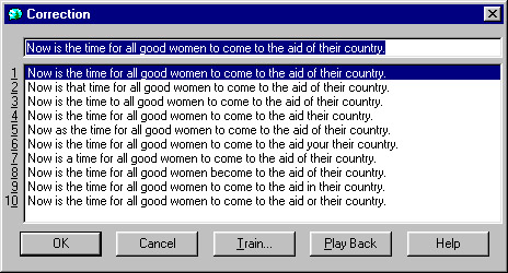
To use another example of aligning graphics and voice, when I arrived at Dragon, the method for correcting a misrecognition was lengthy and fraught with conceptual gaps. The user had to say “Correct ” which would take them to a separate window shown here:

- The old “Correction Window” in NaturallySpeaking
A list of alternate recognitions appeared in the window with numbers next to each. How does one control that window by voice? If a person wanted to choose (e.g.) the second choice, they would often say “two” in usability tests. But that would instead replace the text in the top field with a numeral 2! (The correct command happens to be “choose two”). After participants did manage to choose the correct option, how were they to return to the main dictation window using their voice? Most participants would say “OK” because that is what the button on the bottom left suggests. The sad result was that the text they had just managed to enter into the field at the top would then be replaced with the letters O and K.

- The new “Correction Menu” in NaturallySpeaking
The image above (forgive the image quality) shows the “Correction Menu” which was my replacement for the “Correction Window” described in the previous paragraph. Now when a user selects a word in the text, whether it is to correct it, replace it, capitalize it, etc, a menu appears next to the selection: Not a new window as before, but a menu in the dictation window. The menu presents the most common commands a user would need at that time (as determined through customer site visits and focus groups) and a list of alternate recognitions with the text “Choose 1” “Choose 2” etc to the left of them. The quotation marks were included. Although there is admittedly more text on the screen than there was in the old Correction Window, the way to edit text by voice has now become much more obvious. This YouTube clip shows a person using NaturallySpeaking and the Correction Menu (at time code 1:19).

